


Color is one of the most powerful tools in interior design, influencing how a room feels, functions, and flows. Choosing the right interior color combination can feel overwhelming, but it doesn’t have to be.
In this guide, we break down the essentials of color theory and explore 12 curated interior design color schemes. Whether you’re revamping a single room or planning a whole-home refresh, you’ll discover practical ideas and inspiration to help you style with confidence. From modern neutrals to rich earth tones and bold primaries, each palette includes expert tips on how to use color effectively, where it works best, and how to avoid common mistakes.
Ready to find the color scheme that suits your style? Let’s get started.
Understanding color theory foundations
A well-balanced interior begins with a strong grasp of color. Knowing how colors relate to each other gives you the confidence to create a space that feels considered, not chaotic.
- Primary colors – Red, blue and yellow are the foundation of all other hues. Use them sparingly but strategically. A navy velvet armchair or a bold red accent cushion can provide structure and visual weight without overwhelming the room.
- Secondary colors – Orange, green and violet are created by mixing two primaries. These tones inject vibrancy and contrast. A forest green occasional chair or burnt orange artwork can energise a neutral space while still feeling curated.
- Tertiary colors – Blends like blue-green and red-orange offer greater nuance. They work especially well in layered interiors. Try introducing these through soft furnishings—think teal cushions, terracotta ceramics or rust-toned upholstery.
Key takeaway: Use primary tones as anchors, secondary tones for contrast, and tertiary tones to create flow and cohesion.
Color schemes and the emotions they evoke
Designing with color sets the emotional tone for how a space feels. Whether you're seeking calm, contrast, or cohesion, the right color scheme brings clarity to your interior vision. Choose your interior design color scheme based on the feeling you want to create:
- Monochromatic – Stick to one color in varying tones and textures for a calm, cohesive look. Perfect for minimalist interiors.
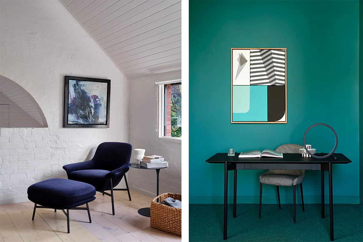
- Complementary – Pair opposites on the color wheel like navy and rust for bold contrast. Use one as the base, the other in accents.
- Analogous – Choose three neighbouring colors like blue, teal and green for a soft, nature-inspired palette with effortless flow.
- Triadic – Use three evenly spaced hues like olive, terracotta and navy for a confident, balanced look. Ground with one dominant color.
Key takeaway: Choose one scheme per space and use texture and material variation to avoid flatness.
The effects of warm, cool and neutral tones
Color temperature shapes the mood of a room—warm, cool, or neutral tones each set a distinct emotional tone.
- Warm – Reds, rusts and golds create comfort and intimacy. Best for living spaces.
- Cool – Blues and greens feel calm and fresh. Ideal for bedrooms or study zones.
- Neutral – Greys, whites and taupes offer timeless flexibility. Use them for key furniture pieces and layer in color through accents.
Key takeaway: Keep your foundation neutral, then use warm or cool tones to guide the atmosphere.


1. Modern neutrals: textured greys, soft taupes and organic hues
A sophisticated, timeless foundation for minimalist styling and textural layering.
Create a calm, cohesive foundation with this timeless palette of cool greys and misty taupes. Perfect for minimalist or contemporary homes, this scheme lets form and texture take centre stage while maintaining a refined, grounded aesthetic. From the depth of charcoal to the softness of stone, this color story balances simplicity with sophistication.
How to use this palette
Use it in open-plan living areas or studies to create a clean, modern feel. Anchor the room with a grey-toned sofa, then layer in soft taupe cushions and a sculptural coffee table in stone, glass or ceramic. Avoid overusing matching greys and add depth with variation in texture and finish.
Materials featured
Fabrics – Leura Pewter, Leura Linen, Milton Fawn, Ashton Stone
Finishes – King Cote® Powder Coat in Rock

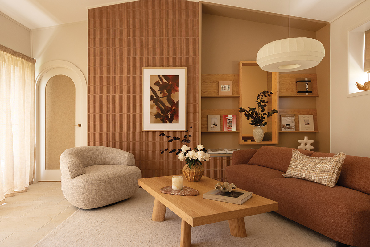
2. Rich earth tones: warm browns, soft creams and organic textures
Creates a warm, grounded atmosphere with a sense of timeless, understated luxury.
Create a calm, cohesive foundation with this timeless palette of cool greys and misty taupes. Perfect for minimalist or contemporary homes, this scheme lets form and texture take centre stage while maintaining a refined, grounded aesthetic. From the depth of charcoal to the softness of stone, this color story balances simplicity with sophistication.
How to use this palette
Inspired by the natural world, this palette blends chocolate and caramel with ivory and cream to create warmth and relaxed sophistication. It’s an ideal interior color scheme for spaces where comfort meets elegance. Textured materials enhance the palette’s depth, delivering an interior that feels lived-in, layered, and quietly luxurious.
Materials featured
Fabrics – Everleigh Sago
Leathers – TrueTouch Wattleseed
Finishes – Timber Veneer Natural Oak

3. Deep forest hues: rich greens and earthy textures
Evokes a sense of grounded tranquillity with a rich, nature-inspired palette, balancing timeless with trend-forward.
Bring the outdoors in with a palette rooted in lush forest tones and earthy textiles. Deep greens offer visual depth and a grounding quality, while layers of velvet, bouclé, and wood create a tactile richness. This home decor color scheme feels immersive and cocooning, making it ideal for homes that value both trend-forward aesthetics and timeless comfort.
How to use this palette
Perfect for bedrooms, home libraries, or formal lounge areas. Pair a forest green velvet sofa with natural oak side tables and cushions in lighter sage or moss tones. Avoid mixing too many competing green tones and instead stick to one dominant shade and build around it with texture and neutrals.
Materials featured
Fabrics – Everleigh Dark Olive, Balmain Wattle, Preston Velvet Fern

4. Burnt earth: warm caramels and rustic spice
Infuses interiors with a sense of warmth, character, and lived-in elegance.
Sunbaked and expressive, this palette channels terracotta, golden caramel, and toasted spice hues to create interiors full of soul and warmth. These colors evoke an earthy, grounded feel, elevated through soft bouclé, velvet, and woven finishes. It’s a style that blends rustic charm with modern polish.
How to use this palette
Use in dining areas, sunrooms, or transitional spaces where natural light enhances the warmth of these tones. Try terracotta dining chairs, spice-toned wall art, or caramel cushions layered over a cream sofa. Avoid pairing with overly cool greys or stark whites as this scheme thrives on warmth and harmony.
Materials featured
Fabrics – Balmain Spice, Leura Caramel, Preston Velvet Tan
Leather – Richmond Tobacco

5. Ocean depths: teal, deep blues and soft mist
Brings a sense of calm sophistication through layered, ocean-inspired tones.
This palette captures the tranquillity of the sea with rich teals, petrol blues and soft greys. Textured weaves add subtle movement, echoing the ever-changing nature of the ocean. Ideal for interiors seeking calm with a confident edge, this palette combines moodiness and lightness in equal measure.
How to use this palette
Perfect for bedrooms, home offices, or meditation spaces where calm is key. Anchor with a deep blue sofa or bedhead, balance with soft grey cushions or a mist-toned rug, and accent with ocean-toned ceramics or artwork. Avoid over-saturating small or dark rooms and introduce soft whites or pale timbers to keep the palette open and airy.
Materials featured
Fabrics – King Cord Petrol, Brunswick Teal Mist, Ashton Sea Mist
Leathers – TrueTouch Tasman Blue, Origin Teal


6. Blush and rust: soft earth tones with a touch of warmth
Trend-forward with timeless appeal, create a serene, feminine edge with grounded warmth and quiet confidence.
This palette blends blush pink, terracotta and rust for a modern yet nurturing color story. It’s a palette with emotional resonance, perfect for those wanting to create comfort with a romantic, elegant feel.
How to use this palette
Use it in bedrooms, reading nooks, or dressing areas. Try a blush-toned sofa, rust velvet cushions, or a terracotta-toned occasional table. Ground the look with neutral walls or a natural fibre rug. Avoid overly saturated pinks and keep tones muted for an elevated aesthetic.
Materials featured
Fabrics – Leura Rose, Everleigh Russet, Byron Russet
Finishes – KingCote® Powder Coat in Blush

7. Deep merlot: Bold burgundy & smoked earth tones
A bold and immersive palette that celebrates the drama and elegance of deep red tones.
This scheme unfolds in rich layers of burgundy, cocoa and clove, offering tones that are indulgent, expressive and full of warmth. Bouclé, velvet, and dark timber enhance the drama, creating a moody, enveloping space. Perfect for those who favour bold design done with sophistication.
How to use this palette
Best suited to formal living rooms, dining rooms, or media rooms where atmosphere matters. Use a burgundy velvet sofa or smoked timber dining table as your anchor, then build in burgundy-toned cushions, cocoa throws and deep plum vases. Avoid clutter as this palette needs space to breathe. Pair with low, warm lighting to enhance the intimacy.
Materials featured
Fabrics – Leura Pinot Noir, Everleigh Russet, Preston Velvet Spice, Everleigh Chocolate
Leathers – Prestige Hickory


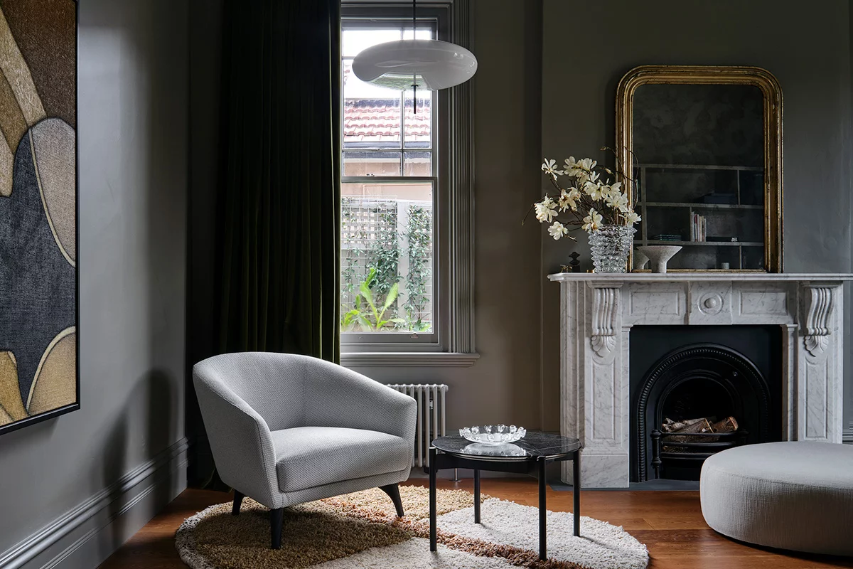
8. Timeless monochrome: Soft neutrals and bold contrast
A refined palette that balances calm simplicity with striking definition.
This color story moves through ivory, stone, warm greys and black to create a palette that’s effortlessly elegant and forever in style. The contrast isn’t loud but deliberate, using texture to add visual interest where color is minimal. This is your go-to palette for understated sophistication.
How to use this palette
Perfect for coastal homes, urban apartments or open-plan interiors. Anchor with a soft grey sofa, contrast with a black side table or monochrome rug, and soften with bouclé cushions or a linen throw. Avoid going overly cold and choose greys with warm undertones to keep the space inviting rather than stark.
Materials featured
Fabrics – Club Natural, Milton Fawn
Finishes – Timber Veneer Onxy, Ceramic Driftwood


9. Primary balance: Bold reds, deep blues and sunlit yellows
A striking, confident palette that plays with the power of pure color.
This scheme takes the foundational primaries—red, blue and yellow—and reimagines them with richness and depth. The result is bold but refined, perfect for playful yet composed interiors. By grounding strong hues in earthy tones and tactile finishes, this palette celebrates color without chaos.
How to use this palette
Use in creative spaces, kids’ playrooms or modern lounge areas where color can energise the environment. Choose one primary as your dominant anchor, like a navy sofa, then introduce the others in art, cushions, or a statement chair. Avoid using all three colors in equal amounts; instead, follow a 60-30-10 balance rule for harmony.
Materials featured
Fabrics – Richmond Tobacco, Preston Velvet Platypus, Spice and Tan, Balmain Spice, and Manhattan Blue Steel
Leathers – Prestige Saddle
Finishes – Natural Oak Timber Veneer

10. Warm neutrals: oat tones, sandy hues and sunlit warmth
A grounding palette designed to bring softness, serenity, and understated warmth to any space.
This palette evokes a sense of calm through sun-washed creams, oat beiges, and warm sandy tones. It's soft and inviting without being flat, perfect for creating spaces that feel open, gentle, and lived-in. Texture is key here: bouclé, brushed finishes, and tactile accents give these neutrals layered depth and dimension.
How to use this palette
Ideal for living rooms, guest bedrooms, or multi-use spaces where a neutral foundation is essential. Anchor with a stone-toned sofa or sand-colored armchair, then add depth through textured cushions, timber furniture, and ceramic accessories. Avoid over-sterilising the space and introduce variation in materials to prevent it from feeling too uniform.
Materials featured
Fabrics – Leura Linen, Everleigh Sago
Leathers – Futuro Fawn and Natural


11. Earth-inspired warmth: clay tones, cinnamon browns and sunbaked neutrals
A warm, grounded palette that draws directly from nature’s most comforting hues.
Rich clay, cinnamon, burnt caramel and muted desert tones blend to create a palette full of depth and soul. Inspired by terracotta tiles and sunbaked landscapes, these hues offer a comforting embrace with a timeless, down-to-earth quality. Combined with timber and textiles, this color story adds mood and richness to both classic and modern interiors.
How to use this palette
Use in dining rooms, kitchen nooks, or layered living zones where warmth matters. Introduce a clay-toned sofa, rust cushions, or a cinnamon feature wall. Balance with oat or stone accents for softness. Avoid pairing with cool blues or overly grey elements as they can dilute the warmth of this look.
Materials featured
Fabrics – Amalfi Blush, Preston Velvet Tan, Amalfi Zebra


12. Nature’s palette: deep greens, cool neutrals and earthy contrast
A refreshing, grounded palette that channels the tranquillity of lush landscapes and forest tones.
This scheme combines tonal moss, sage and forest greens with pale stone and warm neutrals for a look that feels both rooted and rejuvenating. It’s ideal for interiors that reflect a love of the natural world, offering harmony and depth without overpowering. Tactile fabrics and organic forms further elevate, creating a sanctuary-like feel.
How to use this palette
Perfect for entryways, bedrooms or indoor–outdoor transitional spaces. Use a moss green bedhead or occasional chair as a feature, pair it with neutral walls and light flooring, then introduce natural materials like oak or rattan. Avoid neon or saturated greens, this scheme thrives on quiet, tonal variation.
Materials featured
Fabrics – Boyd Autumn Mist, Eveleigh Dark Olive, Leura Biscotti,
Leathers – Prestige Saddle, Tasman Rock
How to add color accents and stay timeless
When exploring indoor color schemes for houses and home decor, a key consideration is often the balance between color and timeless appeal. To keep your space feeling timeless while introducing color, focus on accents that are easy to update. Start with a neutral foundation for sofas, armchairs, dining tables and bedframes in versatile tones like stone, charcoal or natural oak. These anchor pieces offer longevity and pair effortlessly with changing palettes. Then, layer in color through:
- Cushions and throws – Quick to swap and ideal for seasonal refreshes. Try deep greens in winter, or rust and spice in autumn.
- Artwork – Use large-scale prints or canvases to introduce bold tones without overwhelming the space.
- Rugs – Ground the room with a patterned or colored rug to tie everything together.
- Occasional chairs – A single chair in a rich velvet or textured fabric can serve as a statement piece while still being easy to relocate or reupholster later.
- Removable furniture covers – Some furniture, like King Living designs, feature removable covers that can be replaced or updated. Switch to bouclé or velvet in a rich hue for added warmth, then change it back to a linen blend when the season shifts.
- Smaller decor – Think ceramic vases, books, or sculptural objects in accent colors that complement your overall palette.
This approach allows your home to evolve with you, while your investment pieces remain cohesive, elegant, and enduring.
Bring your color story to life
The right interior decoration color combination will reflect your personality, shape your mood, and add lasting value to your home. With a strong foundation in color theory and 12 thoughtfully curated interior design color schemes to choose from, you’re ready to bring your vision to life with clarity and confidence.
Whether you're designing a single room or a whole home, explore indoor color schemes for houses that are as timeless as they are personal. Visit your nearest King Living showroom to see these home decor color schemes in person, explore premium fabrics and finishes, and find expert guidance tailored to your style.
Looking for more inspiration?
- Discover 14 simple ideas to makeover your living room
- Learn about modern eclectic style with Interior designer Karen Jones Russell
- Explore King Living sustainable fabrics


