


 Showrooms
 Contact
 My Account
 Track Your Order


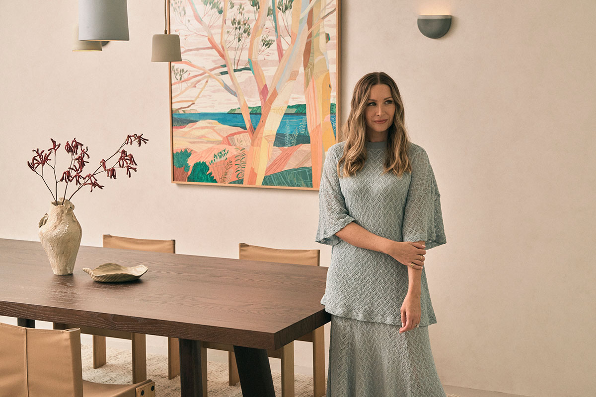

Color choice is deeply personal. It’s instinctive and emotional, often informed by experiences we can’t always name. Artists understand this well. So do interior experts.
In this Creative Spaces collaboration, we explore how color moves from intuition to intention through two distinct yet complementary practices. Artist Ben Waters, who is represented by Michael Reid Northern Beaches, creates work shaped by memory and feeling. Interior designer Kerrie-Ann Jones translates an instinctive relationship with color into practical, liveable interiors.
Together, they reveal an intuitive approach to color, freeing you from rigid rules and empowering you to create a space that reflects who you are, not what’s expected.
Ben Waters on color as emotion and memory
In the coastal suburb of Avalon, light moves gently across Ben Waters’ studio. Paintings lean against walls, layered with tones and textures drawn from the Northern Beaches landscape.
It's a place where feeling comes first. Color is not chosen to replicate what’s seen, but to express what’s felt. For Ben, color is never literal.
“When I paint, I’m not necessarily trying to paint what’s in front of me,” he explains. “I’m trying to paint what I feel inside.

|
EXPERT TIP Color inspiration can be found all around you. Look to the landscapes, materials and moments you’re naturally drawn to, then translate them through feeling rather than imitation. |
Living and working on Sydney’s Northern Beaches, Ben draws constant inspiration from his local surroundings. Cliff edges, shifting light, weathered trees and quiet daily walks all feed into his work. Rather than recreating these scenes, he filters them through memory and mood.
“I have a lot of difficulty matching color to reality,” he says. “I usually work with tone instead. I’m always looking at the lightness and darkness of color and how that fits together.”
This focus on tone rather than exact hue allows his work to feel expansive and personal. Areas of calm sit beside moments of detail, creating a balance that reflects how nature itself feels.
“If it’s busy and the color is too loud, there’s too much going on,” Ben explains. “That’s not what I experience in nature. There’s always a combination of busyness and calm.”
“I do use a lot of neutral colors in my work as well, and I think the neutrality of those colors helps to balance the complexity of the compositions."

|
EXPERT TIP Instead of focusing on matching colors to an exact palette you have seen, try looking at how tones work together. Trust your own instincts and choose one color at a time. |
His process often begins with a single color, which then informs the next, and the next after that. Palettes evolve organically, shaped by seasons and his mood.
“I know a work is finished when the feeling at the end matches the feeling I had when I first started thinking about the painting.”
When a piece leaves the studio, Ben sees it not as a final statement, but as the beginning of a new conversation.
“I hope people continue that conversation in their own way,” he says. “When they bring it into their home, it becomes part of their story and hopefully sparks their own memories of being in nature.”

From artwork to interior: Where design takes over
An interior designer known for her calm, grounded aesthetic, Kerrie-Ann approaches color with the same sensitivity as Ben, but with a clear eye for how it functions in real homes.
“Selecting a color palette for a room is really based on how I want it to feel,” she explains. “It’s an intuitive process.”
In this Seaforth home on Sydney’s Northern Beaches, Ben’s artwork becomes the starting point. Rather than treating art as an afterthought, Kerrie-Ann uses it to inform the broader palette of the space.
“Art can come in at the very beginning of a project, or throughout,” she says. “It can either inform the palette, or add a bit of tension and surprise.”
Here, the artwork acts as an anchor, guiding decisions around furniture, materials and textures without dictating them outright.
|
EXPERT TIP Start with a piece of art you genuinely love and let it lead. Identify two or three tones within the artwork, a dominant shade, a supporting color and a neutral, and use these to inform your larger furniture and material choices. |

Building a color palette: Kerrie-Ann’s practical approach
While Ben’s process is instinctive, Kerrie-Ann’s role is to translate that instinct into a clear framework customers can apply at home.
1. Start with how you want the space to feel
Color should always serve emotion before aesthetics.
“I tend to gravitate towards warm neutral palettes,” Kerrie-Ann says, “and then introduce earthy colors like sage greens, which really ground a space.”
Before choosing colors, ask yourself how you want the room to feel. Calm and restorative. Warm and welcoming. Energised but balanced. This emotional intention becomes the filter for every decision that follows.

2. Begin with a neutral foundation
A neutral base creates longevity and flexibility. Kerrie-Ann often starts here, especially in living spaces.
“Neutrals are timeless and easy to work with,” she explains. “They create a grounding foundation.”
In this home, the Max Sofa forms that base. Covered in Richmond Wattle fabric, its earthy green tone feels both grounded and natural, echoing the surrounding landscape without overpowering it. As a large furniture piece, it establishes the palette early and allows other elements to layer naturally around it.
3. Layer color gradually
Rather than introducing color all at once, Kerrie-Ann builds it slowly, much like Ben’s painting process.
“I like to layer color through thoughtful pieces,” she says. “Furniture, rugs, artwork and accessories.”
Here, texture plays a key role. A richly textured rug adds warmth underfoot. Timber tones are mixed rather than matched, with darker coffee tables sitting comfortably alongside lighter vintage pieces.
“I don’t think you need to stick to one timber tone,” Kerrie-Ann notes. “Mixing materials adds personality.”

4. Let artwork bring contrast
While the foundation remains calm, the artwork introduces depth and contrast.
“Art can add personality and tension,” Kerrie-Ann explains. “It stops a space from feeling flat.”
Ben’s artwork brings bolder, more expressive color into the room, balanced by the restraint of the surrounding palette. The result feels layered and intentional rather than busy.

5. Test before committing
For those unsure about color, Kerrie-Ann encourages starting small.
“Begin with neutrals, then introduce color through layers like cushions or throws,” she suggests. “It’s a low-risk way to see how color makes you feel in the space.”
She also recommends living with samples at home.
“Bring fabric samples into your space and see how they work with the light and other materials,” she says. “That’s where confidence comes from.”
Ultimately, the success of a palette comes down to feeling.
“When it feels right, it probably is,” Kerrie-Ann says. “The tones need to speak to you.”

Art meets home
In the finished Seaforth living space, art, furniture and materiality sit in quiet harmony. The Max Sofa anchors the room with warmth and presence, while Ben’s artwork adds movement, memory and emotional depth.
Designed not around trends, but around feeling, the space and colors become considered and personal.
As Ben reflects, “I'm never going to do as good as nature can. That's why I combine what's inside me with what I can see in nature, so in that way I am bringing an element of portraiture because I'm bringing so much of myself to that artwork.”
And through Kerrie-Ann’s considered approach, the personal becomes something practical and enduring to live with and live well.
Ready to build your own living room color palette? Start here:
1. Define the feeling. Decide how you want the room to feel before choosing a single color. Calm, grounded, warm or energised.
2. Choose one anchor piece. This could be a sofa, artwork or rug. Let it guide the direction of your palette.
3. Build on tone, not trend. Focus on how light and dark elements balance each other rather than matching exact shades.
4. Layer gradually. Introduce color through texture and smaller pieces first, allowing the palette to evolve naturally.
5. Live with it. Test samples in your space and notice how they feel at different times of day. If it feels right, trust it.
Follow on Instagram
Explore Ben Waters Art
Ben’s available works can be viewed and acquired via the Michael Reid Northern Beaches website, or by contacting the gallery directly at [email protected]. We encourage those who admire his practice to join the gallery mailing list for early previews and priority access to forthcoming releases, as demand is strong and waiting lists are typically extensive.
Explore more
- Discover the Max Sofa and its customisable fabric options
- Step inside the color drenching trend
- Explore interior design color combinations for every style
DATE PUBLISHED
26 February 2026
FEATURED EXPERT
Ben Waters, Artist
Kerrie-Ann Jones, Interior Designer
WRITTEN BY


